
How the American Statistical Association and The New York Times created a feature which engages students in statistics through graphs about the world around them.
- The American Statistical Association sought to broaden students’ exposure to graphs and how graphs use data and statistics to tell stories about what is happening in the world.
- The New York Times publishes many graphs that tell stories about a diverse set of current issues. The New York Times Learning Network wanted to expose more students to these graphs.
- Teachers of mathematics and other subjects seek free and concise teaching resources that engage students, often answering the question “Why are we learning this?”
In the summer of 2017, the objectives of these three parties – the American Statistical Association, The New York Times and teachers, came together with What’s Going On in This Graph?, a free, weekly online feature. Each release of this feature focuses on one previous-
ly published New York Times graph and provides the opportunity for students worldwide to analyze statistics through noticing and wondering about the graph. Students can discuss the graph in class or as homework, or better yet, they have the option to respond online with live-moderation by statistics teachers and other students. To date, hundreds of thousands of students have “noticed and wondered” about the graphs. There have been more than 50,000 student responses on The New York Times Learning Network online public forum.
How did the American Statistical Association, The New York Times and teachers come together? It started with a Boston public school teacher, Sharon Hessney. She read the morning newspaper daily with her coffee and clipped out graphs that she thought her students would find intriguing and surprising. Displaying the graphs before class started, she asked “What do you notice?” and “What do you wonder?” These questions employ a teaching strategy developed by the math educator Annie Fetter. All students got involved since the questions had what we now call “a low floor” – all students can notice and wonder something about the graph, and “a high ceiling” – students can build on each other’s insights to reach an understanding that probably, on their own, they would not attain individually. After a 5 to 10 minute discussion to tease out the story of the graph, the class resumed on the math topic of the day. She was pleased to hear that students were still talking about the graphs even after this very brief exposure.
When Ms. Hessney read that the American Statistical Association was requesting ideas for how to expose more students to statistics, she suggested that they approach the New York Times Learning Network, a free, online resource that provides hundreds of daily, weekly and monthly teaching resources each year to help people teach and learn with The New York Times. With a continual flow of excellent New York Times graphs and the free online Learning Network platform, this provided an avenue to deliver very high quality statistics to students worldwide.
A phone meeting was set up with the editors of the Learning Network. Ms. Hessney explained what she had been doing in her classroom for over a decade. She knew that the New York Times graphs were some of the best graphs – for their varied graph types, use of statistical and mathematics concepts and range of topics. Using the teaching strategy of noticing and wondering, teachers could use the New York Times graphs and accompanying articles for students of any level. Teachers could tease the story out of graphs with minimal preparation.
The editors suggested, “How about having a feature What’s Going On in This Graph? This suggestion is a takeoff on the very successful Learning Network feature What’s Going On in This Picture? For this feature, students explain what they think is happening in a previously published New York Times photograph.
There is a day of online student responses and teachers moderating replies, followed by the Learning Network revealing the free link to the article that included the photo. For What’s Going On in This Graph?, the same would be done, but there would be four questions that the students would be asked to answer:
1. What do you notice?
2. What do you wonder?
3. How does this relate to you and your community?
4. Create a catchy headline that captures the graph’s main idea.
A previously published graph, with the four above questions, are released on Fridays. The feature is free to teachers and students, including all New York Times articles referred to in the feature. On the following Wednesday, for five hours, Ms. Hessney and a rotating group of more than 60 statistics teachers moderate student responses. The majority of responders are high school students, but there are respondents from middle school through college. Registrations indicate that responders come from across the United States and around the world. Teacher replies attempt to take the individual student to the next level of understanding. Also, students reply to each other. Where else do students have an opportunity to discuss graphs, as well as current topics, with peers from around the globe?
On the day after the online discussion, the Reveal is published. Written by Ms. Hessney with the statistics professors Roxy Peck and Erica Chauvet, it includes not only the free link to the article that included the graph, but also background information on the graph’s topic, “shout-outs” for the best headlines submitted online, additional questions about the graph and Stat Nuggets – definitions of statistical and mathematical terms that are used in the graph and how they relate to the graph.
To see a brief tutorial on What’s Going on in This Graph?,go to this three-minute video.
Here’s the first graph released by What’s Going on in This Graph” on September 19, 2017.
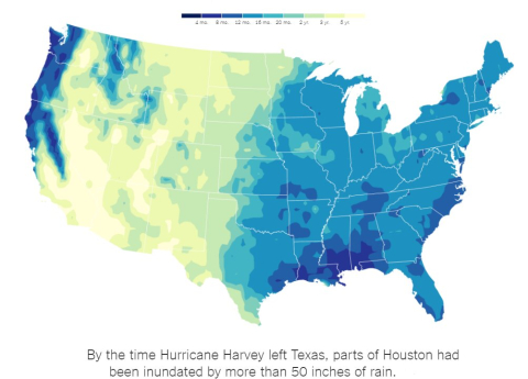
Source: The New York Times’s What’s Going On in This Graph? September 19, 2017 © The New York Times Company
There were 550 online responses. One response, in particular, showed that we were onto achieving our objective of giving students the opportunity to have graphs that relate to the world around them. The students said, “Now I know why we read “The Grapes of Wrath.” This book is an American classic read by many high school students. It is about farmers from the center of the United States (seen in this choropleth with yellow representing very little rainfall) who move West (blue, green and yellow) for a better life. Did the student now understand the farming challenges due to limited water Americans have as they move to places where they think there will be more opportunity? I suspect yes.
Since then, there have been more than 160 graph releases. The topics have been as varied as worldwide immigration to the cost of engagement rings. There have been 54 graph types from the basic time series graphs to bar Mekko charts. There are Stat Nuggets for more than 160 mathematics and statistics terms, enabling all teachers, including those with no statistics background, to easily use What’s Going On in This Graph?
One of the reasons why What’s Going On in This Graph? is used by so many teachers is the graph selection. The four criteria for selecting graphs are: students see themselves in the graph, there is a surprise, students learn about the world around them, and the graph is timely. Week by week, the topic, graph type, and level of difficulty varies. If teachers find that a week’s graph is not appropriate for their students, they can select a past graph from the archives that list releases by topic, graph type and Stat Nugget. There is no lack of graphs to notice and wonder about.
Here is what we hear from teachers about why students get engaged with What’s Going On in This Graph?
- The graphs are about topics they are interested in.
- They get to discuss the graphs with their classmates and, if they respond online, with other teachers and peers from around the world.
- A graph is like a puzzle; students get absorbed in figuring out what story the graph is telling and what its surprise is.
- Students feel empowered when they can reason about a graph they have never seen on a topic that they know little about.
In summary, the goal is to offer a free teaching resource that requires minimal teacher preparation time, engages students, and is centered on their teaching goals on topics about the students’ world. What’s Going On in This Graph? meets these criteria and more. Try it out and see for yourself.
About Sharon Hessney:
A high school mathematics and statistics teacher, who has been the “curator” of the graphs, feature writer and morning moderator. She administers the feature by recruiting the more than 57 moderators who have a broad diversity by location and expertise. She speaks with teachers who use WGOITGraph? to find out their best practices and regularly presents at conferences, webinars and podcasts.
Source(s):
ISLP Newsletter Vol 15.2 December 2023